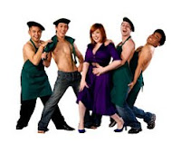
Yes, it’s a familiar plot. Yes, they moved from Ohio. Yes, I really really wished they would bust out at least one verse of “Why-o Why-o Why-o did we ever leave Ohio?” and give props to Wonderful Town. No luck. Instead, we got this:
The Good
- It’s been a long-time dream of mine to write a musical that takes place in the tech world. I’d love to see some choreographed typing and dancing around cubicles and modern office spaces. This show took a stab at it and actually did a whole musical number involving modern rolling office chairs! It was pretty great actually, they did some fun choreography and cleverly danced around each other as they navigated their chairs into different patterns. Only four dancers and chairs though, and nothing else but chairs and them on stage- still it made me smile and I was impressed.
- The main character, Margaret (played by Sarah Kathleen Farrell) has to really hold this show together. As the red-head fag-hag, she does one outrageous musical number after another, each time raising the stakes, until eventually she’s acting out an S&M scene in full leather. If she had been weak, this show would’ve crumbled. Instead, she was having a blast on stage and helped us have a great time too.
 There were two songs I loved. One is the up-beat very fun song “Heterosexual” where Margaret belts out her joy at finally finding a guy in SF to date who isn’t gay. Bringing in a kick-line and taking this song entirely over the top, gets a laugh out of everyone. This is also the tune that stuck in my head and I was singing days later. Next, I thoroughly enjoyed the song “Plumbing.” Upon discovering that her straight boyfriend is actually a transsexual, Margaret sings a dark tune about “the wrong plumbing” while her backup male dancers hold up actual plumbing pipes in different patterns to spell and insinuate things during her song. It was an impressive clever way to pull off a dance number.
- This show is constantly chiding Starbucks every chance it gets. Starbucks becomes more and more powerful throughout the show, beginning to sell groceries, oil, and even Chinese food. The little riff they sing each time Starbucks acquires a new product line was alright. But after drilling it into our heads through the entire show, having the final Starbucks riff come when a two-timing boyfriend finds himself “so busted at Starbucks” is pretty funny.
The Bad
- I think the first rule of theater is that no one singing alone on stage should EVER put their hands in their pockets. Don’t give these actors pockets if they’re going to do that. Luke’s ballads should be strong and powerful, instead he came across as scared and insecure. Too bad.
- The first act ends with a car crash. The second act begins with a song whose chorus tells us that “time heals all things.” We as the audience naturally assume a death has happened. Imagine our surprise when we learn that our male protagonist has instead “moved back to Ohio.” WHAT? That made no sense.
The Ugly
- I have never, in my entire history of seeing shows, been more distracted by a set. This set almost single-handedly ruined this show. It was a cartoony/childish construction of the façade of some SF houses, with a stylized Golden Gate Bridge backdrop. One problem- it never changed. Whether they were in an office, Rainbow Grocery, Starbucks, their apartments, a nightclub- same set. They just stood in front of the very colorful, very poorly made, very unaligned and off-perspective set. The set screamed “don’t take this show seriously, this is a spoof, this is silly.” The show tries to throw in a lot of serious songs and moments, which is totally thwarted by the set. Other problems… when they would open a window from the set, it didn’t line up with where the painted window was. Intentional no doubt, but ultra distracting! The lines weren’t straight on any window, the bridge changed perspective angle halfway across it- I spent way too much of this show being distracted by this cartoony set. Even a minimal set or a blank wall would’ve been more effective than what they have. Considering this show has been running for over a year now, I wish they’d invest a bit more effort in the set.

No comments:
Post a Comment